Describe a Pie Chart
About the analysis
This out-of-the-box narrative app generates a narrative that describes a pie chart and highlights statistically relevant insights from the underlying data to explain the chart in more detail.
Details covered in the analysis
The length of the narrative and the level of detail the narrative contains depend on which narrative length option is selected in Step 3 of the wizard. The narrative includes some or all of the following:
the totals as numbers and percentages.
the biggest and smallest contributors, contributors with uniform distributions, and outliers.
Note
Dates are always reported using the formal American written format. For example, "January 1, 2021".
Required dimensions and measures
This app can analyze:
Minimum requirement: two measures, or one dimension (can be a time dimension) and one measure. ImportantThe Entity Type field of each time dimension must be set to | 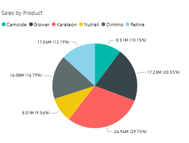 |
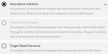
If your data selection does not meet the specific requirements for a particular app, that app is grayed out and unavailable for selection. For example, if no time dimensions have been configured, the Time-Based Variance app is disabled:
 |
Configuration options
The following options are available to configure in the Configure Narrative wizard:
OPTION | DESCRIPTION | LOCATION |
|---|---|---|
Step 3: Tell me how you want to say it | Summary: produces a narrative of filtered facts in a more concise way than the Important things option. Important things: produces a narrative of filtered facts based on Arria's ranking algorithm. Tell me everything: produces a narrative that includes every fact extracted from your data by Arria's algorithms. Default: Important things. | 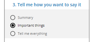 |
