Describe a Bar Chart
About the narrative
Details covered in the analysis
The length of the narrative and the insights it includes depend on the number of measures and dimensions selected and the configuration of the Narrative length option. Choose to generate a Summary that describes only the most significant insights derived from the dataset or configure a more detailed narrative using My key insights.
The narrative includes:
A summary of the overall total for Profit, the number of Countries, the most significant contributors, and, if they exist, outliers.
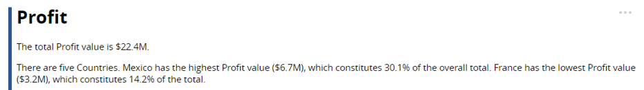
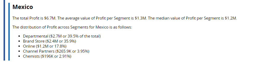
For each Country: the total, average, median, and mode (if the same value appears more than once), and the distribution of Profit across Segments highlighting any outliers.
Tip
Set the order of dimension drilldown in Step 2 of the NLG Apps wizard.
Set the threshold for including drivers and offsets (dimension instances) and the order in which they're described (ascending or descending) using the Narrative length field in Step 3.
See Narrative options for further guidance on configuring the narrative.
Data requirements
All NLG apps have the same data requirements for field names and formats. See Data field names and formats for details.
In addition, each app has specific data requirements:
Dimensions and measures
The requirements for dimensions and measures are:
*The Describe a Bar Chart app does not perform time series analysis and uses both time and non-time dimensions for drilldown analysis. For example, select the Year and Quarter fields to analyze the distribution of profit over a year, broken down by quarter:
 |
To analyze variance over time, use the Time-Based Variance app.
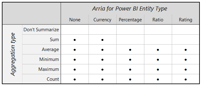
Aggregation and entity types
Not all combinations of aggregation and entity types are supported for measures. The Describe a Bar Chart app can analyze the following combinations:
 |
Note
Entity types and other data attributes are set in Step 2 of the wizard.
Narrative options
You can configure these narrative options in Step 3 of the NLG apps wizard:
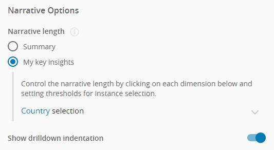 |
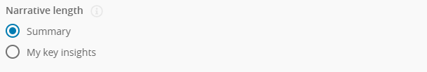
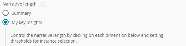
You have two options to control the verbosity of the narrative and the priority of the insights found:
Summary
Choose Summary to generate a brief overview of the main insights.
 |
My key insights
Choose My key insights to control which insights are included in the narrative.
 |
For each level of drilldown, the Describe a Bar Chart app sorts dimension instances in order of contribution to the dimension's total.
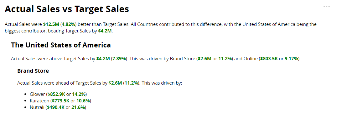
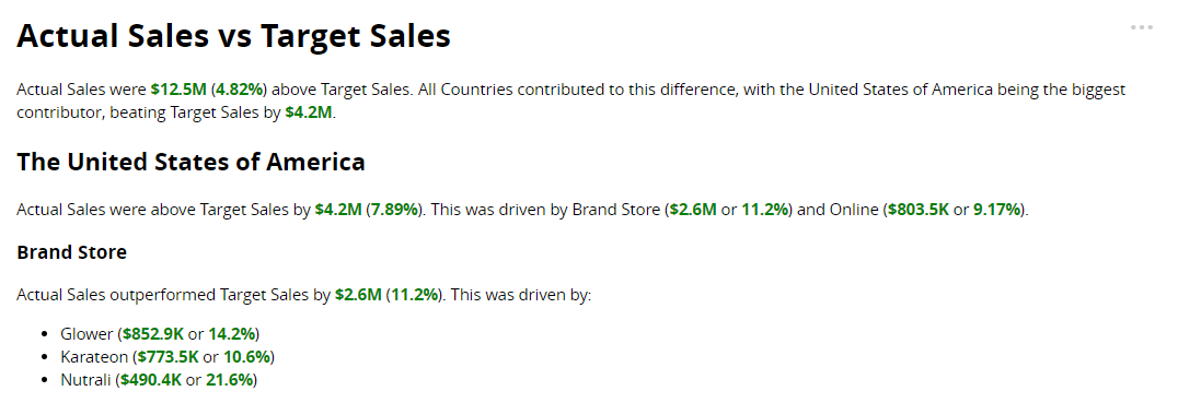
The example below shows part of an analysis of Profit by Country and Segment. The narrative describes the total Profit for Ireland — reporting the values for total Profit, average Profit, and median Profit — then describes the contributors to total Profit.
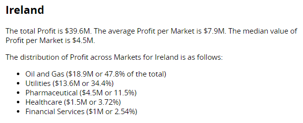 |
The contributors are Segment dimension instances (e.g. Oil and Gas). The Describe a Bar Chart app sorts the dimension instances according to their contribution to the total Profit in Ireland.
At each level of drilldown, the My key insights option offers three ways to set the sort order for dimension instances and control how many instances are described in the narrative.
Number of instances (default option)
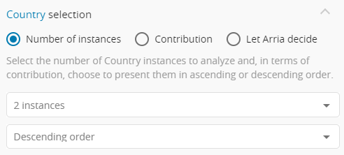 |
Select the number of instances to include in the narrative.
Default:
2 instancesChoose to sort dimension instances in ascending or descending order.
Default:
Descending
Example
Assume the sort order is descending.
If you select 2 instances, the narrative only drills down into the top two contributors.
Contribution
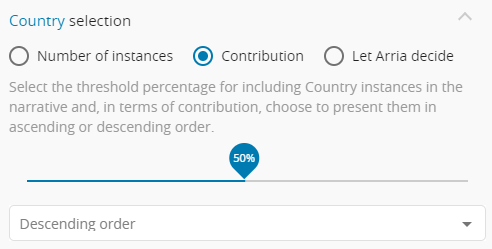 |
Select the threshold percentage for including dimension instances in the narrative.
Default:
50%Choose to sort dimension instances in ascending or descending order.
Default:
Descending
Example
Assume that the threshold percentage is 50% and the sort order is descending.
In this case, the Describe a Bar Chart app sorts the dimension instances from lowest to highest in terms of contribution to the total Profit. The app then works through the list of dimension instances from top (highest contributor) to bottom (lowest contributor), summing the contributions until the total represents a 50% (or greater) contribution to the total.
If the app reaches the threshold by summing just the top two dimension instances, the narrative only drills down into those two dimension instances.
Let Arria decide
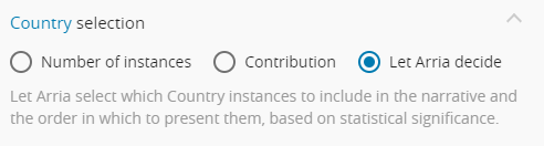 |
The list of dimension instances is sorted in descending order.
Arria's algorithms select the most significant insights to include in the narrative.
Set this option to ON to indent the narrative at each level of drilldown.
Default: ON
Show drilldown indentation | Example |
|---|---|
|  |
|  |
